Symmetry
Symmetry means a mirror image -- one side is the mirror image of the other. Symmetry can occur in any orientation as long as the image is the same on either side of the central axis.
This type of image has great appeal -- it makes for "good" shape relationship. Many people automatically gravitate to symmetry. We are symmetrical after all -- two eyes, two ears, etc.. Look around at consumer products and graphics (printed materials) to see how many use symmetry. You will find that it is the dominant organizational concept.
This type of image has great appeal -- it makes for "good" shape relationship. Many people automatically gravitate to symmetry. We are symmetrical after all -- two eyes, two ears, etc.. Look around at consumer products and graphics (printed materials) to see how many use symmetry. You will find that it is the dominant organizational concept.


|


|
Symmetrical balance is also called formal balance because a form (formula) is used -- a mirror image about a vertical axis. The results look formal, organized and orderly.
There is a strong emphasis on the center axis in symmetry since all of the information is reflected from there. This should be taken into consideration when designing with symmetry. It is easy to over emphasize the center.
Symmetrical balance guarantees left to right balance, which is the most important aspect of balance. But there is more to balance than that. Top to bottom balance is also important. Most images seem more stable if the bottom seems slightly heavier. If the top seems too heavy the composition can look precarious.
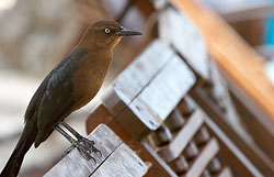
Rule of Thirds
Professional photographers, graphic designers, and artists of all kinds use the “Rule of Thirds” principle to compose their photographs and art pieces.
Applying the rule of thirds takes some practice and forethought, but creates magnificent photographs.
While most people naturally center an image in their viewfinder, the rule of thirds uses a slightly different approach. When looking through your viewfinder, imagine the frame divided into thirds both horizontally and vertically so that you have nine equal-sized parts. The rule of thirds states that the four points where the lines intersect are the strongest points in which to place the most important feature of your photo.
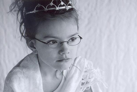
You will also want to use this technique when you photograph someone who is not looking directly at the lens. Be sure to allow their eyes some room to gaze into the photo. If the composition is off, the viewer will be drawn away from the subject instead of towards them.
But what if sometimes the image doesn't turn out and it creates a wrong visual effect? All is not lost. Thanks to photo editing software, most composition issues can be corrected. Simple cropping can much to change your existing off-balance photo into one that follows the “rule of thirds” principle.


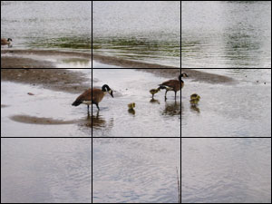
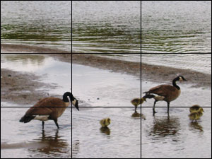
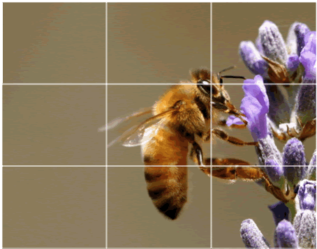
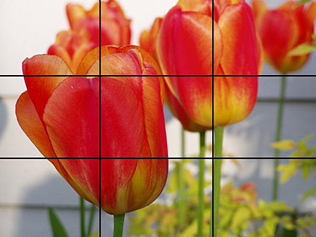
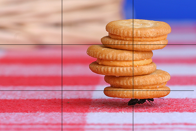
The rule of thirds states than an image is most pleasing when its subjects or regions are composed along imaginary lines which divide the image into thirds — both vertically and horizontally:
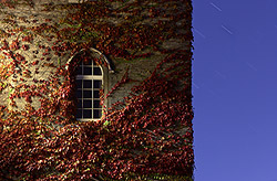
Rule of thirds composition (Note: the image is not "centered")
|
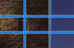
Instead the image is situated in 2/3rds of the image
|
It is actually quite amazing that a rule so seemingly mathematical can be applied to something as varied and subjective as a photograph. But it works, and surprisingly well. The rule of thirds is all about creating the right aesthetic trade-offs. It often creates a sense of balance — without making the image appear too static — and a sense of complexity — without making the image look too busy.
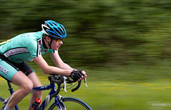
The rule of thirds can also be used to compose pictures when subjects are moving. You typically want anything moving through the frame– like a car or cyclist– to have space to move into. Off center images can give the viewer a sense of movement.
The rule of thirds can also be used to compose pictures when subjects are moving. You typically want anything moving through the frame– like a car or cyclist– to have space to move into. Off center images can give the viewer a sense of movement.
|
|
Cropping

|

|
Sometimes cropping is necessary to enforce the rule and yields a clear improvement. It is often quite amazing how you can resurrect an old photo and give it new life with something as simple as cropping it. Notice above that part of the empty sky was cropped off so that the horizon aligned with the upper third of the image — adding emphasis to the foreground and mountains.
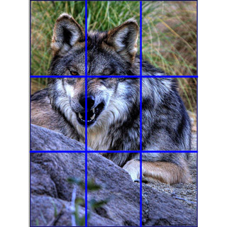
Other Rule of Third Examples
Do not center the subject in the frame. Instead position the subject in the top third or lower third section of the frame, or the left or right third section of the frame. Also, remove extra space when cropping and try to fill a third of the frame with your subject.
|
|
