In The Non-Designer's Design Book, Williams discusses four basic principles that all visual design should balance:
|

|
- Alignment: Every visual element on a page should have some kind of connection to at least one other element. Nothing should be positioned haphazardly.
- Repetition: Common elements, such as colors, graphics, layout styles, and so on, should be repeated to give a consistent look and feel to a page.
- Contrast: The idea of contrast is to make dis-similar elements very different. Contrast is one of the most powerful visual design tools.
Proximity
Items relating to each other should be grouped close together. When several items are in close proximity to each other, they become one visual unit rather than several separate units. this helps organize information, reduces clutter, and give the reader a clear structure.
|

|
Group related items together. Use spacing to convey visually what information is related. Bits of information that are not related should not be in close proximity to other bits on the page. This helps create visual structure and organization and communicates more clearly. It serves as a visual clue to where you should start reading the piece and where you should stop.
In the example below of what a business card would surely look like if a printing company designed it, how many times does your eye stop? (should be about four since there is info in the top two corners)

Original
|

Revised
|
However, the design looks much better when related bits are grouped, (except in the most formal of situations). How many times does your eye stop? Twice. No more.
Alignment
Nothing should be place on the page at will. every element should have some visual connection with another element on the page. This creates a clean, sophisticated, fresh look.

|

|
The bulk of the body text uses the same font and same text alignment throughout. There may a certain style for all main articles, another for captions or informational text, and another for headlines or chapter headings, etc. but there is a great deal of consistency from one part of the book or magazine to the next or one page of the site to the next.
Alignment in Print

Be sure to draw "imaginary" lines so that each of your elements have a visual connection with another element on the page.
Alignment on Web Pages
Placement of items on the page is essential to Web page design. There are many ways to affect the layout of your page. The best method is to use CSS to style your layout. A popular, but outmoded method is by using tables. I'll show you how to use a simple CSS style property to align your images, tables, paragraphs and more.
Most alignment of text in a paragraph is to the left side of the page, but you can also align your paragraphs to the right and center.
<p> Using the float property, you can align your paragraphs to the right or left of the parent element. Any other elements inside that parent element will flow around the floated element. To get the best effect with a paragraph, it's best to set a width on the paragraph that's smaller than the container (parent) element.
<p> Align the Text Inside Paragraphs Arguably, the most interesting alignment for text in paragraphs is "justify". This tells the browser to display the text aligned, essentially, to both the right and left sides of the window. To justify the text in a paragraph, you would use the text-align property.
<p> You can also align all the text inside a paragraph to the right side or the left (the default), using the text-align property.
<p> The text-align property will align the text inside the element. Technically, it's not supposed to align images that are contained inside the paragraph or other element, but most browsers treat images as inline for this property.
Aligning Images Using the float property on an image tag <img> you can define the placement of images on the page and how the text will wrap around them. Just like the paragraphs above, the float style property in the image tag will position your image on the page and tells the browser how to flow text and other elements around that image.
<img src="image.gif" alt="image" /> Text following the above image tag will flow around the image to the right as the image displays to the left of the screen If I want the text to stop wrapping around the image, I use the clear property.
<br /> Aligning More Than Paragraphs But what if you want to align more than just a paragraph or an image? You could simply put a style property in every paragraph, but there is a tag you can use that is more effective: <div></div>
Simply surround the text and images (including HTML tags) with the <div></div> tag and the style property (float or text-align) on it and everything in that division will be aligned how you'd like it. Keep in mind that alignments added to paragraphs or images within the division will be honored, overriding the <div> tag.
Repetition
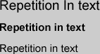
Repeat visual elements throughout the site. You can repeat colors, shapes, textures, spatial relationships, line thickness, fonts, sizes, graphic concepts, etc. This develops the organization and strengthens the unity.
Contrast
Avoid elements on the page that are merely similar. If the elements are not the same, then make them VErY dIffERENT. Contrast is oft the most important visual attraction on the page.
Everything on the page needs to be visually connected to something else, nothing should be out of place or distinct from all other design elements.
