General
- Speed up reading by using an optimum column width of 39 to 52 characters.
- Implement general rules about body copy by using a minimum of 9 point type and a maximum of 14 point type (depending on age and reading skills of the audience and physical size of the piece). Leading should be 2 points more than the point size of the type (e.g., 9 point type, 11 point leading).
- When using more than one type face, make sure they are very different (e.g., Kuenstler (fancy script) and Helvetica (sans-serif).).
- Avoid using more than two different type families in one project.
- Safely use one typeface with two different styles (e.g., use a light or regular weight with a bold or extra bold weighted font). Try to skip a weight (e.g., light and bold vs. light and medium). When you can't skip a weight increase the size of the heavier font.
- Never use all caps for body copy - in the immortal words of Nancy Reagan, just say NO!
- Never use all caps with highly decorative typefaces (e.g., Zapf Chancery, Kuenstler).
- Use rules rather than the underline style, which runs through the descenders of lowercase letters. Set rules to clear the descenders by a least 2 pts.
Justification & Alignment

|
Individual words or entire blocks of text can be set in four basic alignments; left (rag right), right (rag left), centered and justified (block).
|
- Left justification is easier to read and is less formal than full justification. Pick the alignment that matches the tone of your design.
- Don't use a short line width with justified text. Text wrap requires extra work to make it look good including editing the copy. Use justified text to be more formal (the left and right margins are parallel)
- Take care when using justified text. Ensure the column width, the size of the type, and the number of characters per line don't leave big gaps between words.
- Left justified ragged right is more personal (left margin aligns and the right margin ends at different places depending on the characters/words in the line).
- Adjust centered and right-aligned type, use soft returns (keeps lines within the same paragraph) to force line breaks when necessary to make the line lengths noticeably different.
Kerning & Spacing
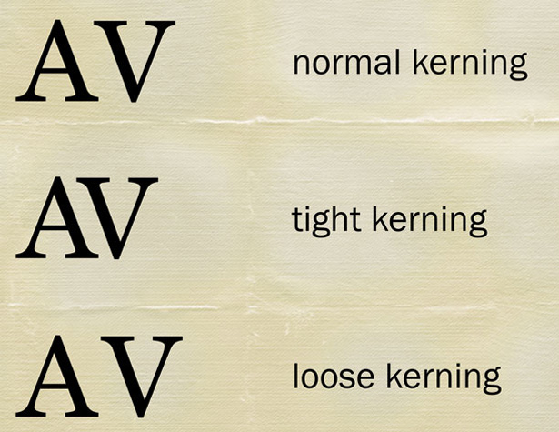
Look for visual gaps between letters or numbers that may occur because of the shapes of the adjacent letters (AT, AV, Te, Wa, 11, etc.). To correct this visual anomaly, known in the trade as ca-ca type, use kerning. Kerning is the removal of incremental space between the offending pair.
Kern type so that the white space between characters is visually equalized. Take the first three letters and visually center the second letter between the first and third letters. Do this for all letters in the word until there are no irregular gaps between letters. |
|
Standardize vertical spacing as much as possible (e.g., spacing between headlines and text, before and after subheads, between paragraphs).
Reduce wordspace and tracking (letter spacing) carefully. If the words or letters are too close together they become difficult to read.
Check and adjust letter spacing and word spacing within lines, specifically for large gaps between words or letters; then paragraph, column, and page breaks in terms of:
- Hyphenation zones (ragged right text).
- Hyphenation blocks (right justified text).
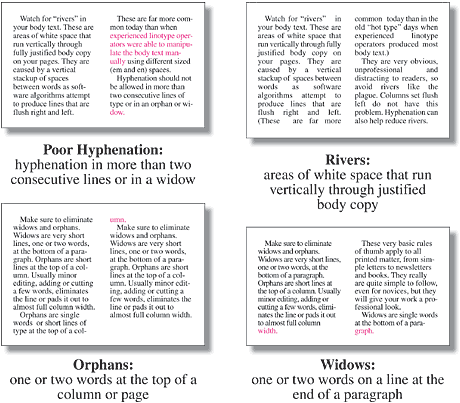
- Widows & Orphans
- Don't leave orphans! (a word or short line at the top of a column or page).
- Avoid widows! (a single word on a line by itself at the end of a paragraph with no one to love).
- Never hyphenate a widow. For that matter, never hyphenate an orphaned widow! (typographic counseling is recommended for individuals with this problem)
Proofing
- Always have someone who did not write the copy, edit the copy.
- Always proof your copy for misspelled words.
- Always have another person (hopefully literate) proof for typos and inconsistencies in style. It's very easy to overlook your own mistakes - just like about 90% of the mistakes.
- Remember, spell checkers only check for spelling, not meaning (e.g., two, too, to or even tutu).
- Don't forget that one misspelled word can undermine the credibility of the entire piece.
Types
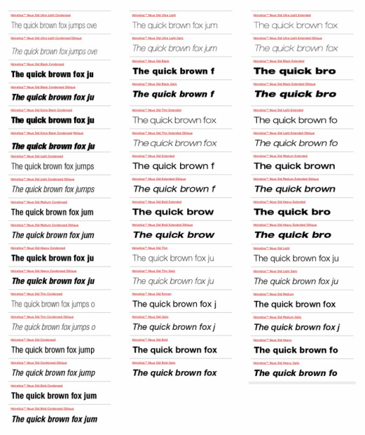
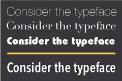
Consists of variations on typeface; regular, italic, bold, bold italic, etc. Some fonts range from ultra light to ultra black and contain other variations like condensed or extended. These come in handy when you need to fit a certain amount of copy across a predetermined length.If you have too many or too few characters, and adjusting the tracking makes the text too difficult to read, consider using a face with multiple widths in the family. Just to illustrate the point here is the Helvetica Neue family according to Adobe.com
A Type Family
Serif

A serif faces contain cross-lines at the end of a strokes. Times is a serif typeface. Serifs help distinguish individual letters and provide continuity for the reader.
Sans Serif

Typefaces without serifs are called Sans Serif. Helvetica is a sans-serif typeface. Sans Serif fonts are also sometimes referred to as gothic or grotesque. For headlines and short bursts of text Sans Serif fonts tend to be more legible and instantly recognizable. Conversely, for body copy, or long passages of text, serif faces are easier to read. (If you want to use sans-serif fonts for long blocks of text, try making the line lengths shorter, and add more leading. Some people believe that san-serif fonts should be used for body text on screen because all the little serifs are not rendered well, but this is a matter of opinion.)
Script Fonts
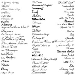
Script faces are designed to mimic cursive handwriting or are made from actual handwriting. These can convey a range of emotions from quiet elegance to a playful casual mood. Script faces set in all caps tend to be extremely difficult to read. If you do use a script face, remember to allow for extra character or line spacing for faces with exaggerated curves, curls, and swashes. Also, avoid long lines of text set in script as this is usually too difficult to read.
|
Decorative Fonts

Display or decorative faces are letter-based fonts that fall outside the previous categories. Due to the detail in the design of these fonts, they usually look best when used in larger sizes such as in headlines, thus, display. Conversely, they tend to be unpractical for use as text because of their limited legibility. This is one of the most popular categories, probably because there are so many of them to choose from. You can achieve just about any look using display faces.
|
Dingbats, Webdings, Symbols

Dingbats are decorative symbols, or glyphs, used by printers and designers to add interest to pages. From bullets to frames to tiles to clip art, these fonts replace each letter and character on the keyboard with a piece of art
|
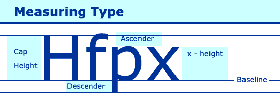
Measuring Type
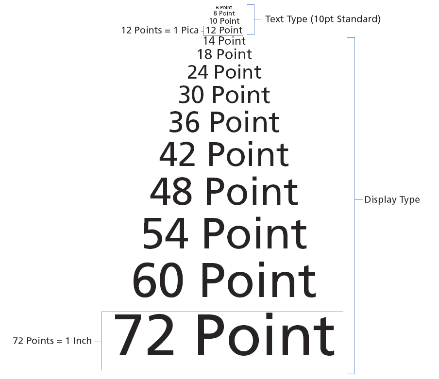
Before computers, when type was cast in metal, it was measured in points. This refers to the height of the metal body that held the individual letter. This was usually slightly larger than the highest and lowest feature in the entire face design.
Traditionally, a point is 1/72 of an inch. Picas are another form of measurement used for type in print. 12 points = 1 pica. 6 pica = 1 inch. This method is still in use today. Most design software for both print and web give you the option in working in points. Print designers often use the term x-height, referring to the height of the lowercase x. According to some studies, readable text starts at 9 points, improves at 10, maxes at 11, then starts to fall off at 12 points, and gets much worse at 14 points. This theory, of course, assumes the reader has unimpaired vision and is reading print. |
Horizontal Scaling
Typefaces are designed to maintain a consistent line quality and serif weight across these variations. Adjusting a font’s horizontal scale will in effect create a new face. For example Helvetica has a consistent line weight around all vertical, horizontal and curved strokes. if you set the horizontal scale of Helvetica to 200%, then the vertical strokes will be stretched to twice the size while the horizontal strokes remain the same. Now the face will have an inconsistent line weight, and is no longer true to the way Helvetica was designed. This is why we have alternate versions of fonts like extended and condensed.

|
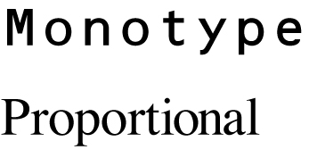
One Space or Two?
Occasionally in a printed magazine or book, you will notice that there is only one space between a period and the start of the next sentence. The rule of two spaces after every period was created for the typewriter that uses mono spaced text. This was a rule created to help the viewers eye notice when one sentence ended and the next one was beginning.
With the advent of proportional lettering and computer fonts, the way the letters are set is much different than the old traditional typewriter. Letters sit next to each other more comfortably, as well as words next to words, therefore only one space is needed for the reader to comprehend the end of a sentence. The extra space looks awkward and disrupts reading in professional publications. If you disagree with the need for only one space instead of two, here is food for thought: Web pages use by default only one space between sentences. HTML is set up to only display one space no matter how many are typed. If you want to insert an extra space between sentences you have to code it in using   using five characters to get one more. |
Line Length
The longer a line of text gets the harder it is for a person to read, conversely, shorter line lengths tend to break up the text and interrupt the reader. The ideal length depends upon the typeface and the type size. Generally, a line should contain between 10 and 50 words for optimum readability.
Type & Color
|
Leading
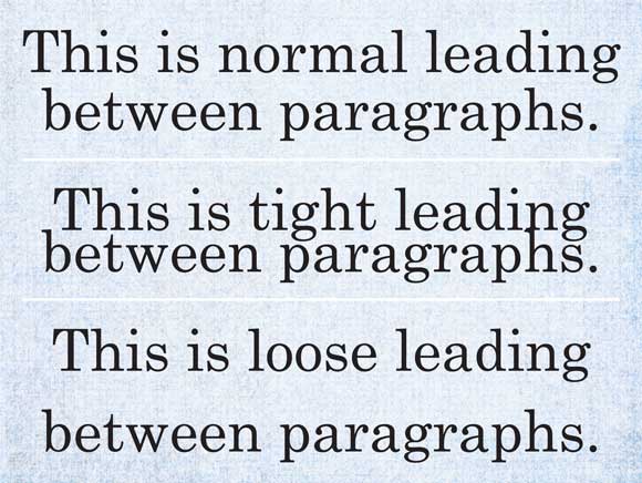
Leading is the vertical distance between lines of text and is generally measure in points. In the days of metal type, printers inserted strips of lead between each line to separate them. Leading is measured from the baseline of one line to the baseline of the next.
Too much leading causes the eye to jump, and too little creates a dark and uninviting paragraph that may cause the eye to skip lines. Text is generally specified as points over leading, 12/18 would mean 12 point text with 18 point leading. 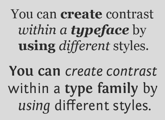
|
Combining Typefaces
- Avoid using an excessive number of typefaces in a single document. Some experts recommend using no more than two families; others set the bar a little higher. Using selective typefaces can help your reader sort information and navigate the document. Too many faces tends to cause chaos.
- Avoid using two or more similar fonts on the same page. Selecting fonts that are not different enough, Times vs. Garamond, also causes conflict.
- Remember, fonts affect your overall design and should be chosen to match the style you want to portray. While readability is important, so is design!
